After reading about the Guggenheim’s astounding exhibition, Hilma af Klint: Paintings for the Future, I was instantly compelled to go. I was able to drop everything and travel across the country, and went to the museum three days in a row to be in the presence of her work to absorb it. (Interestingly, I met others at the museum who has been pulled there too. It reminded me of a scene out of Close Encounters of the Third Kind.) The experience was a life-changing pilgrimage, and I became a devoted fan and student of af Klint’s work.
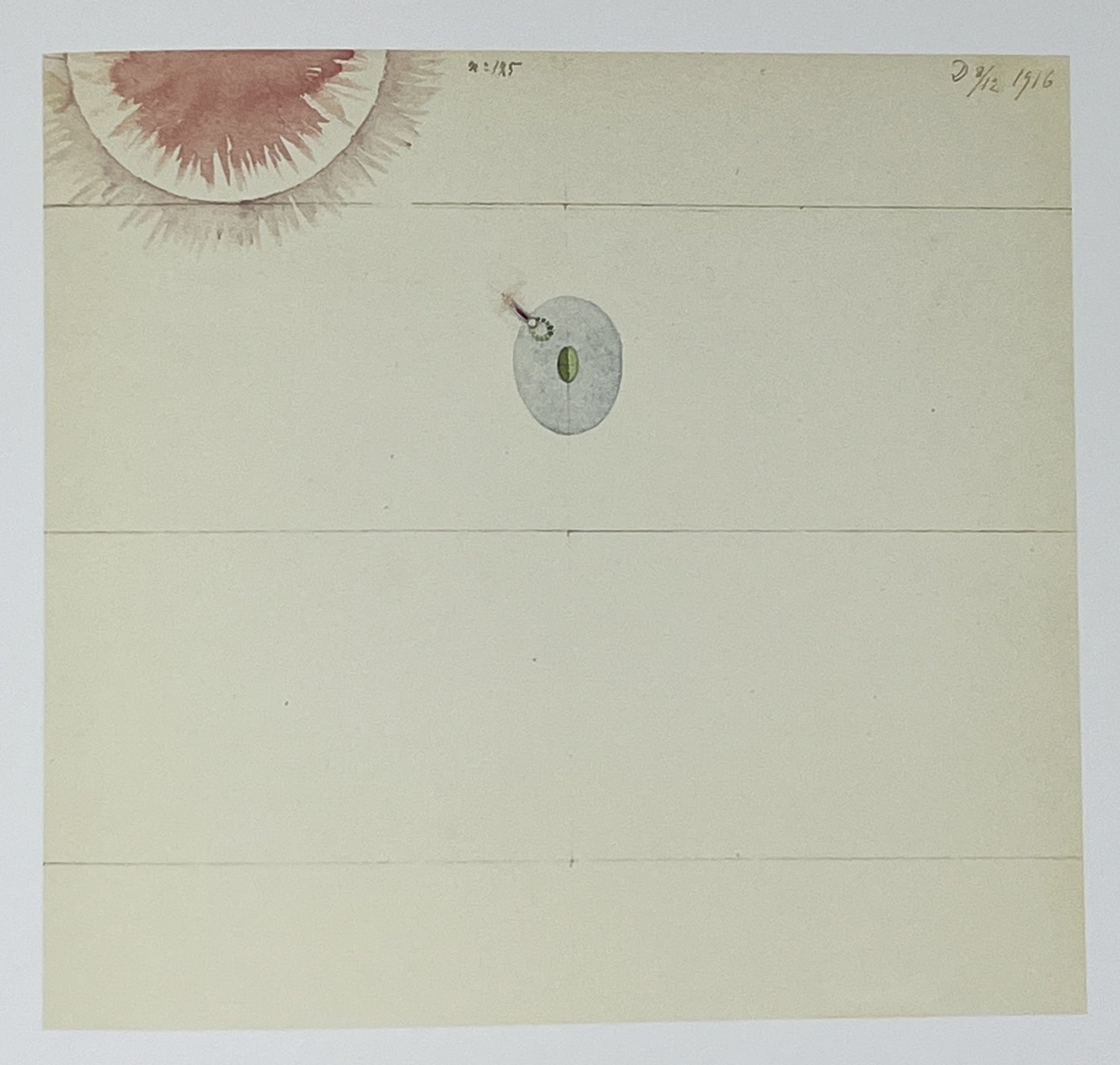
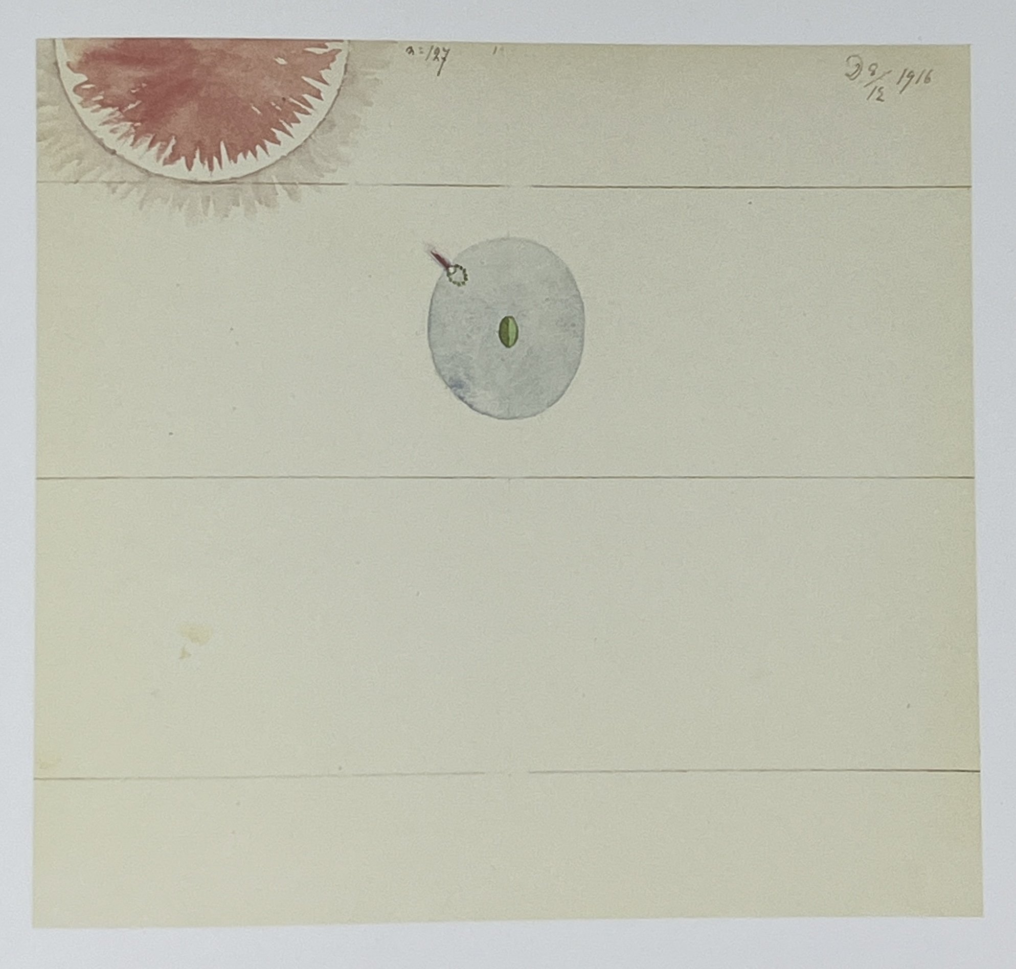
After receiving the Hilma af Klint Catalogue Raisonné as a gift a few years later, I committed myself to carefully studying a few pages every morning. As I was working my way through Volume 4: Parsifal and The Atom Series (1916 - 17), I became transfixed by a series of paintings in Group 4 of the Parsifal series. Each painting was nearly identical to the one before, with only slight changes, and numbered in sequence. Why?
#125
#126
#127
After staring at these paintings for a few days, it clicked. They looked like frames for an animation. I took photos of each image with my phone and edited them together into Final Cut Pro in the order specified by af Klint. The results stunned me.
I found the same pattern in Paintings No. 31 - 37 of the Parisfal Series.
The more I looked, the more I realized the entire Parsifal series could be viewed as an animation.
I poured through her other series to see if this pattern continued. I found it again in The Atom Series (1917).
So many questions opened up for me. Could the The Swan (1915) also be viewed as an animation?
How about the The Dove (1915) series?
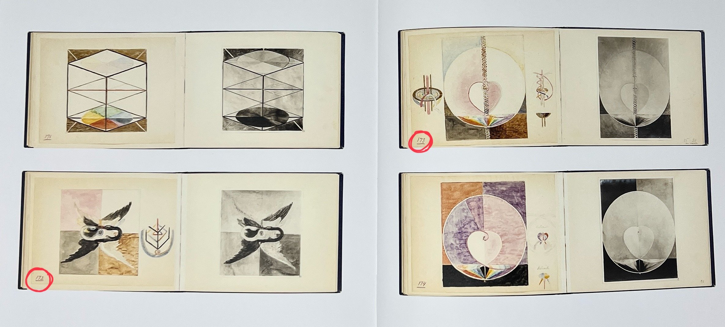
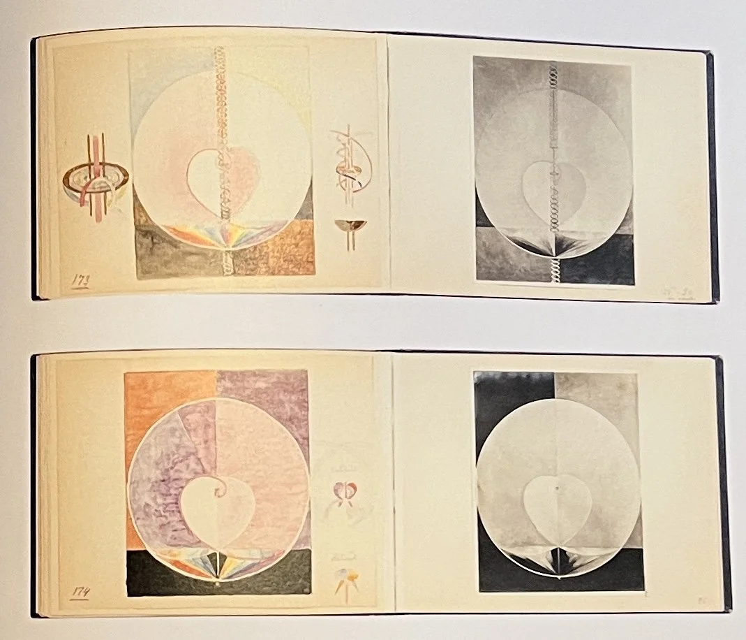
In The Blue Books, the 10 sketchbooks af Klint made in preparation of her seminal series The Paintings for the Temple, the final painting in The Swan series is numbered #172 and the first painting in The Dove series is #173.
The Blue Books
Is it possible she intended The Swan series and The Dove series to be experienced as a continuous narrative?
And if that is true, is it also true for the entire 192 paintings in the Paintings for the Temple series she cataloged in The Blue Books?
Are the paintings intended as keyframes, and the small sketches in the margins of The Blue Books and her other studies intended as perspective and movement cues for the frames in-between?
Here is my first pass at interpreting these directional indicators sprinkled throughout her studies as clues, starting with a simple animation (click image to see post on Instagram):
The questions, experiments and discoveries around this inquiry keep unfolding for me.
Animation was an emerging art form when af Klint was making her paintings. I’m wondering if she had been exposed to it as a pre-existing creative medium or if she simultaneously invented it through her own work?
I’d like to look at the paintings in Volume 1: Spiritualistic Drawings (1896 -1905), Volume 5: Geometric Series and Other Works (1917 - 1920) and Volume 6: Late Watercolors (1922 - 1941) to see if the same animation keyframe patterns emerge.
I’d also like to study Paintings for the Temple (1906 - 1917), beginning with #1 from Primordial Chaos, and ending with #187 from Altarpieces. My guess is there is a coherent narrative arc with keyframes connecting all of these paintings.
And finally, I’d like to take a pass at animating the in-between frames of the Paintings for the Temple, referencing the illustrations from the Blue Books as a translation exercise. Although this would take a lot of time and work, I just want to see it.
A huge thank you to the Hilma af Klint Foundation, the Axel and Margaret Ax:son Johnson Foundation for Public Benefit, Bokförlaget Stolpe, and co-editors Daniel Birnbaum and Kurt Almqvist for these extraordinary resources. As Birnbaum says, “A catalogue raisonné is necessary in order to see the different cycles, motifs and symbols that recur in such an exciting way. If someone really wants to understand how Hilma af Klint's works function, they need these books." After this experience, I completely agree!
